First impressions count, which means welcome communications are among the most important we will send to our students. Based on a recent overhaul at Lancaster University, Luke Davis offers his top tips.
1. Listen to students
Focus groups, vox pops and surveys – we used them all to map the student journey and understand their challenges. They told us they want clear, simple guidance on key steps such as what to pack and how to register. They said not to send too many emails or bunch up all our messages just before they get here. And they also made it clear our communications can have a positive emotional impact – they want to be made to feel welcomed, reassured and valued.

2. Strike the right tone
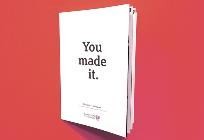
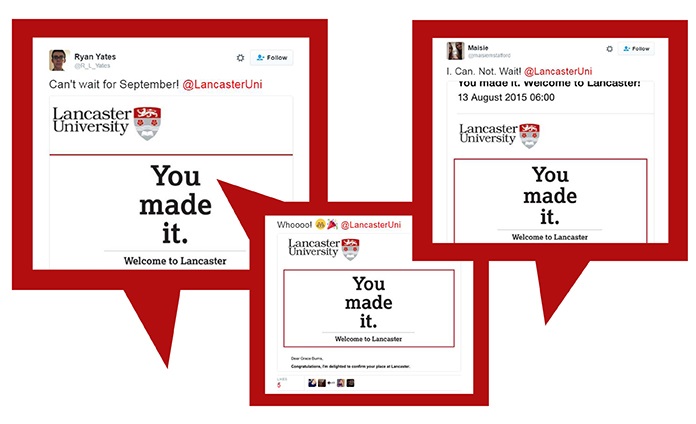
Imagine how a student feels on results day – the excitement, nerves and, all being well, elation. In 2015 we aimed to match that emotion with our communications. Take a look at the ‘You made it’ graphic that featured on the first communications we sent – an acceptance email and printed Welcome Guide. The aim was to produce something bold, striking and shareable. Students told us that receiving a personally addressed guide made them feel valued while the social media response suggested the message struck a chord.

3. Co-ordination is key
At Lancaster we have four faculties, 28 departments, nine colleges, one students’ union and a range of professional services. And everyone is keen to get in touch to welcome our new students. That can cause confusion, so in 2016 we all agreed a week-by-week timeline that explains exactly what information we will send and ensures that communications are spread out over the vacation period. Students receive it on A-Level results day inside their printed Welcome Guides.
4. Go interactive
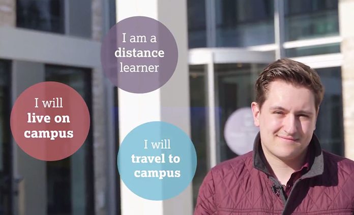
One of the big problems we face is that there are so many different types of students – distance and campus learners, undergraduates and postgraduates, home, EU and internationals. So how do you get the right advice to the right people? Our solution was to develop interactive online tools that let students choose their own information. Take a look at the 2016 Welcome Schedule. It contains college, union, central and academic events for all students all in one place. And with a few clicks, any student can filter their own personal schedule. We used the same idea in our new interactive Welcome Video, featured on the homepage of our 2016 Welcome Site. It lets students click within the video to see sections that apply to them. We hadn’t seen interactive video used by a UK university before, but we are confident it will help our students reach information relevant to them.
5. Be responsive
The Welcome Site, the video, the schedule and tools such as the pre-arrival checklist that appear on our mobile app iLancaster – everything works just as well on a smartphone as it does on a desktop, which means students can access it anywhere, at any time.
6. Keep it short and sweet
Our students say they want to access essential information as quickly as possible. Thanks to our interactive video, students don’t have to sit through irrelevant information. We cut the Welcome Guide by about a third in 2015 and the Welcome Site is more concise too. They each direct students to the right tools at the right time and provide a short, simple path through the pre-arrival and Welcome Week period. That’s the aim, anyway. We’re looking forward to see what feedback we get this year.


