In part one of this series, Claire Povah explained how Lancaster University mapped the student journey, in a bid to better understand their needs. In this blog, Chris Dixon explains how the map informed the development of apps to give students a smoother start to academic life.
I’m sure you can picture the scene. A long line of fresh, keen students snaking down the campus, clutching their hand luggage and nervously chattering, pretending they are not feeling like a fish out of water, jostling for a place in the rapidly changing social hierarchy.
The queue winds its way towards the library. The students pull ragged pieces of paper from their pockets and bags, some kind of form, or so it appears. The rumour spreads along the line that the form can be exchanged for the most precious of commodities – a library card, and perhaps even the Holy Grail, a user account for the computer systems.
Believe it or not, this is not some throwback to simpler times, but the current reality in many universities today. This, despite the increase in mobile technology and internet connectivity, the era of the mobile app and the fact that all the students in the line will have a smartphone in their pocket and are probably WhatsApp-ing away as they queue.
It is possible to make process improvements easily and quickly and to try to put an end to the queues.
The fact remains that many on-boarding processes are hopelessly paper-based. Sure, there is some evidence to suggest that students quite like the queues; it’s a chance to meet people and orientate themselves around the campus, but after a while when you stand and watch the winding queue you resolve that this year, you’ll do something about it.
Understanding the journey
The first problem is to understand the complexity of the journey and this is why colleagues in Student Based Services started a project to map the student journey at Lancaster, sharing the finished product with colleagues in order to enhance and improve the student journey.
Once we had understood the journey, we could finally start to look at improving processes and using technology to make things easier.
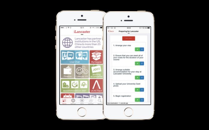
From a technology perspective we already had a mobile phone app, iLancaster, which was delivered as part cloud service, used by many other UK universities. We had also built our own locally developed services on top of this platform. We decided that by using the app to target the various “zones” of the journey map, we could support students from their first thoughts of Lancaster all the way to the end of the map – and onwards to parts even the map couldn’t reach.
Firstly to engage with students in the “preparation and decision” phase, we created an application for undergraduate and postgraduate offer holders. This was authenticated via a username based on their personal email address supplied either to UCAS or as a direct applicant. We then aimed to personalise the content to their chosen degree, as well as information about the Lancaster area, jobs or scholarships they could apply for and links to allow them to track the progress of their application.
We also included mapping information and local campus information where we knew the applicant would be attending campus for an interview. Areas like choosing accommodation were provided within the app, and we had over 40 thousand clicks for undergradtute and postgraduate applicants, accessing information about accommodation and pricing, including interactive 360 degree panoramic images.
To engage with students in the “booking” stage, we created an applet that allowed the electronic upload of a photo for use on the university card. We also provided an interactive checklist called “Prepare for Lancaster” which was tailored to the specific pathway that the student was on, for example an international student.
The checklist was data driven, meaning that steps which may have already been completed were ticked. We were also able to give them early access to their timetable, to assist in planning. Through in-app notifications we were able to alert students to any applicable changes as well as reminding them of any preparation tasks that have not been complete.
Once the students arrive we allow them to use interactive searchable maps to help them orientate themselves around the campus. We see a peak in usage around the start of the term as students access this invaluable help in finding the main places around the campus.
Queue busting
Supporting the registration process was achieved using two applications. In the student’s app, we provided an “e-ticket” which would allow them to bypass some of the queues at registration. We found that an 100% paperless registration process was not possible as students still needed to have their identity documents checked and to collect a physical library card, but by providing an e-ticket that registry staff could scan, significantly sped up the process. We also provided a separate “Queue Buster” application to staff at registration that would allow them to take photographs of students who had not submitted them, as well as track and trace applications.
Once the students have been registered and collected their full IT account details, we provide further support and personalisation including their full exam and course timetable, Moodle VLE and many other useful apps.
In conclusion, it is possible to make process improvements easily and quickly and to try to put an end to the queues. The key steps are:
- Understand who owns the overall process and get buy-in before you do anything
- Map the whole journey from all the perspectives you can
- Check this with the students
- Use agile development, with a mobile first approach to produce apps that help the students navigate the process
Have we eradicated the queues? No, but we have made significant enhancements to the experience of both students and staff, and gathered valuable data to make further process changes. We’ve engaged with the student community and now have a platform that we can use to drive further change.


